library(tidyverse)
counties <- read_csv("https://raw.githubusercontent.com/sds-192-intro-fall22/sds-192-public-website-quarto/a8b64e3070ca2543b904d4d92780b09e6062ced6/website/data/nbi_counties.csv")
route_prefixes <- read_csv("https://raw.githubusercontent.com/sds-192-intro-fall22/sds-192-public-website-quarto/a8b64e3070ca2543b904d4d92780b09e6062ced6/website/data/nbi_route_pre.csv")
maintenance <- read_csv("https://raw.githubusercontent.com/sds-192-intro-fall22/sds-192-public-website-quarto/a8b64e3070ca2543b904d4d92780b09e6062ced6/website/data/nbi_maintenance.csv")
kinds <- read_csv("https://raw.githubusercontent.com/sds-192-intro-fall22/sds-192-public-website-quarto/a8b64e3070ca2543b904d4d92780b09e6062ced6/website/data/nbi_kind.csv")

nbi_ma <- read.delim("https://www.fhwa.dot.gov/bridge/nbi/2022/delimited/MA22.txt", sep = ",") |>
  left_join(counties) |>
  left_join(route_prefixes) |>
  left_join(maintenance) |>
  left_join(kinds) |>
  filter(SERVICE_ON_042A == 1) |>
  select(STRUCTURE_NUMBER_008, COUNTY_CODE_003_L, ROUTE_PREFIX_005B_L, MAINTENANCE_021_L, YEAR_BUILT_027, ADT_029, STRUCTURE_KIND_043A_L, STRUCTURAL_EVAL_067, BRIDGE_IMP_COST_094) |>
  mutate(STRUCTURE_KIND_043A_L =
           case_when(
             STRUCTURE_KIND_043A_L == "Concrete continuous" ~ "Concrete",
             STRUCTURE_KIND_043A_L == "Steel continuous" ~ "Steel",
             STRUCTURE_KIND_043A_L == "Prestressed concrete continuous" ~ "Prestressed concrete",
             TRUE ~ STRUCTURE_KIND_043A_L)) |>
  mutate(BRIDGE_IMP_COST_094 = BRIDGE_IMP_COST_094 * 1000)

nbi_hampshire <- nbi_ma |> filter(COUNTY_CODE_003_L == "Hampshire")

rm(counties, kinds, maintenance, route_prefixes)Plotting Frequencies
SDS 192: Introduction to Data Science
Lindsay Poirier
Statistical & Data Sciences, Smith College
Fall 2022

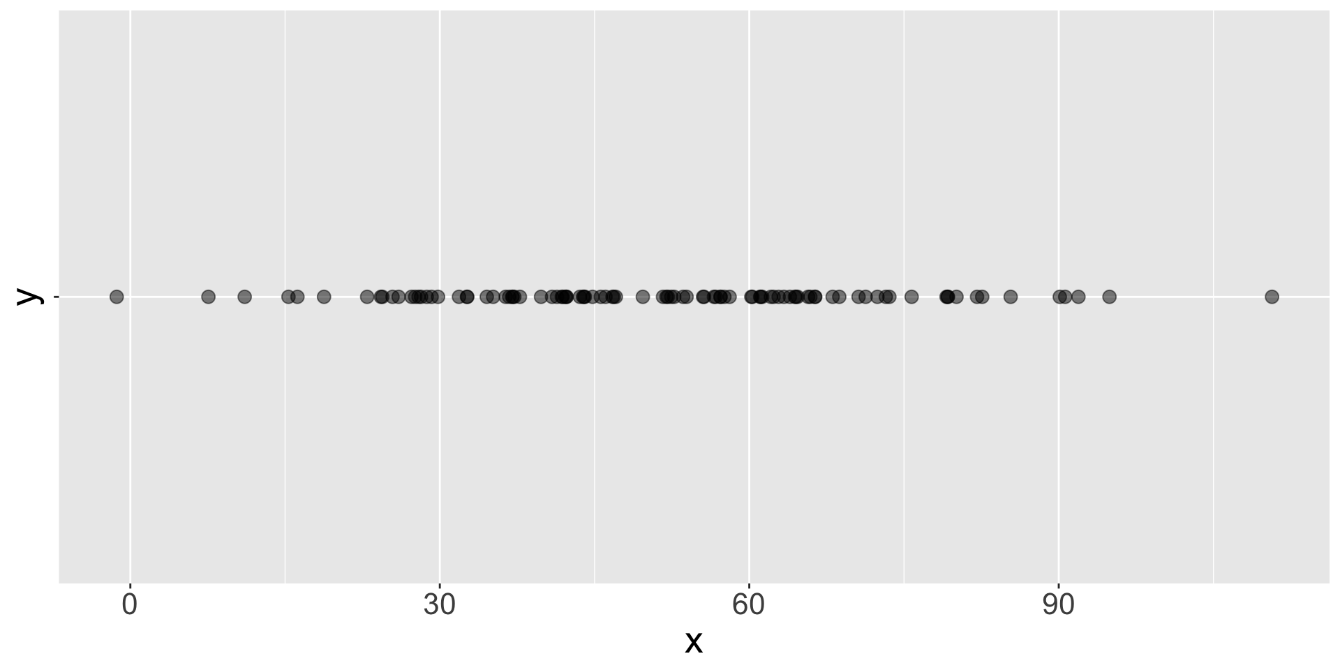
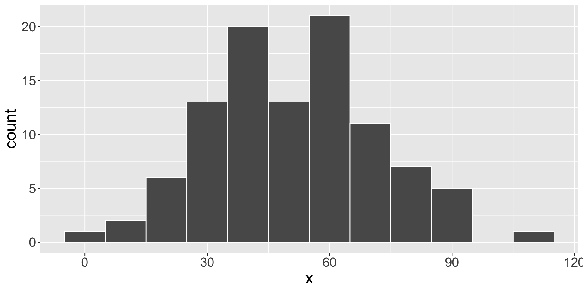
Histogram
- Visualizes distribution of a numeric variable
- What are maximum and minimum values?
- How spread out are the values?
- What is the center of the values.


Histogram
- Create bins for numbers, each with the same range of values [i.e. 0-10, >10-20, >20-30, and so on]
- Converts the linear scale to a categorical scale
- Count the numbers in each bin
- Set the height of a bar for that bin to the count
Bar Plot
- Visualizes counts of a categorical variable
- Which value appears the most?
- Which appears the least?
- How evenly distributed are the counts?
[1] "a" "b" "c" "a" "c" "a" "a" "b" "c" "a" "b" "c"
Bar Plot
- Determine the unique values and places them on the x-axis
- Count the number of times each value appears
- Set the height of a bar for that category to the count
[1] "a" "b" "c" "a" "c" "a" "a" "b" "c" "a" "b" "c"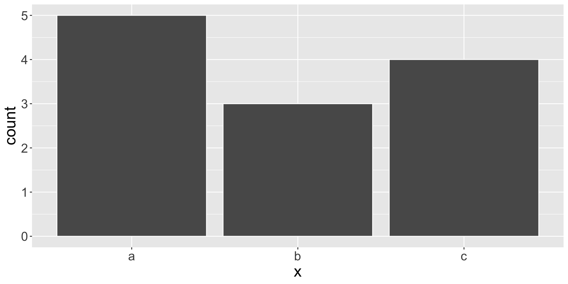
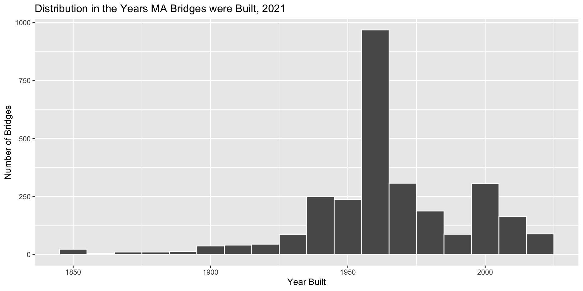
Distribution in MA Bridge’s Years Built

Bidwidth vs. Bins
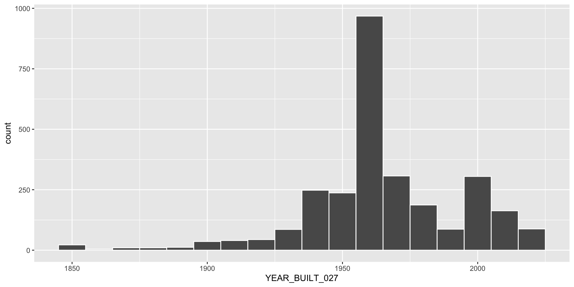
How would we describe this plot?
Faceting a Histogram

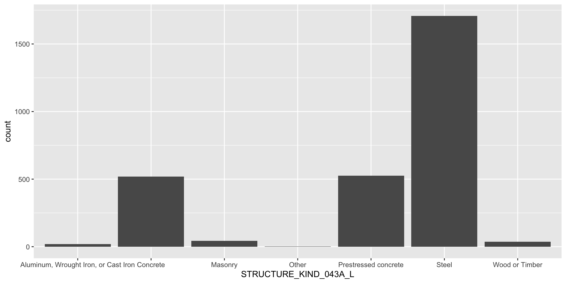
Frequency of Structure Kinds
Labels for this Plot

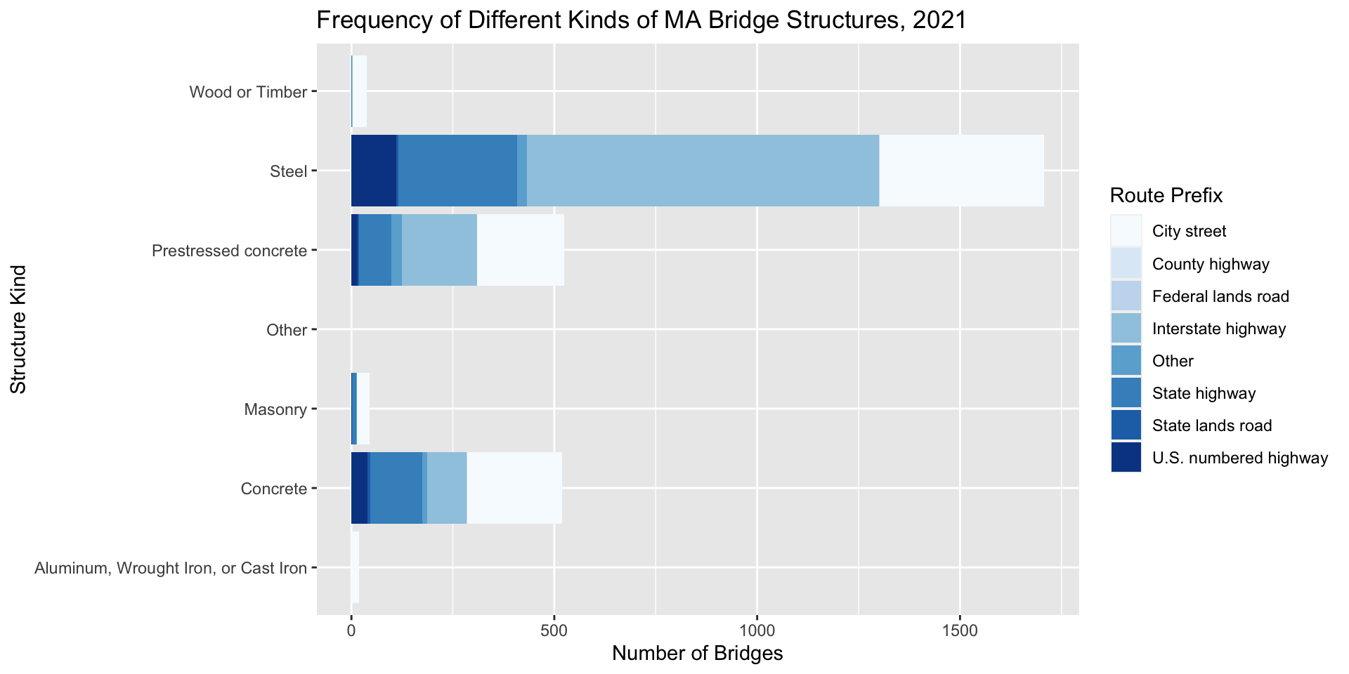
Stacked Bar Plot

Learning Check: Why not this?
Dodging
ggplot(nbi_ma, aes(x = STRUCTURE_KIND_043A_L, fill = ROUTE_PREFIX_005B_L)) +
  geom_bar(position = "dodge") +
  coord_flip() +
  labs(title = "Frequency of Different Kinds of MA Bridge Structures, 2021",
       x = "Structure Kind",
       y = "Number of Bridges",
       fill = "Route Prefix") +
  scale_fill_brewer(palette = 'Set3')
Converting to Percentages
ggplot(nbi_ma, aes(x = STRUCTURE_KIND_043A_L, fill = ROUTE_PREFIX_005B_L)) +
  geom_bar(position = "fill") +
  coord_flip() +
  labs(title = "Frequency of Different Kinds of MA Bridge Structures, 2021",
       x = "Structure Kind",
       y = "Number of Bridges",
       fill = "Route Prefix") +
  scale_fill_brewer(palette = 'Set3')