library(tidyverse)
counties <- read_csv("https://raw.githubusercontent.com/sds-192-intro-fall22/sds-192-public-website-quarto/a8b64e3070ca2543b904d4d92780b09e6062ced6/website/data/nbi_counties.csv")
route_prefixes <- read_csv("https://raw.githubusercontent.com/sds-192-intro-fall22/sds-192-public-website-quarto/a8b64e3070ca2543b904d4d92780b09e6062ced6/website/data/nbi_route_pre.csv")
maintenance <- read_csv("https://raw.githubusercontent.com/sds-192-intro-fall22/sds-192-public-website-quarto/a8b64e3070ca2543b904d4d92780b09e6062ced6/website/data/nbi_maintenance.csv")
kinds <- read_csv("https://raw.githubusercontent.com/sds-192-intro-fall22/sds-192-public-website-quarto/a8b64e3070ca2543b904d4d92780b09e6062ced6/website/data/nbi_kind.csv")
nbi_ma <- read.delim("https://www.fhwa.dot.gov/bridge/nbi/2022/delimited/MA22.txt", sep = ",") |>
left_join(counties) |>
left_join(route_prefixes) |>
left_join(maintenance) |>
left_join(kinds) |>
filter(SERVICE_ON_042A == 1) |>
select(STRUCTURE_NUMBER_008, COUNTY_CODE_003_L, ROUTE_PREFIX_005B_L, MAINTENANCE_021_L, YEAR_BUILT_027, ADT_029, STRUCTURE_KIND_043A_L, STRUCTURAL_EVAL_067, BRIDGE_IMP_COST_094) |>
mutate(STRUCTURE_KIND_043A_L =
case_when(
STRUCTURE_KIND_043A_L == "Concrete continuous" ~ "Concrete",
STRUCTURE_KIND_043A_L == "Steel continuous" ~ "Steel",
STRUCTURE_KIND_043A_L == "Prestressed concrete continuous" ~ "Prestressed concrete",
TRUE ~ STRUCTURE_KIND_043A_L)) |>
mutate(BRIDGE_IMP_COST_094 = BRIDGE_IMP_COST_094 * 1000)
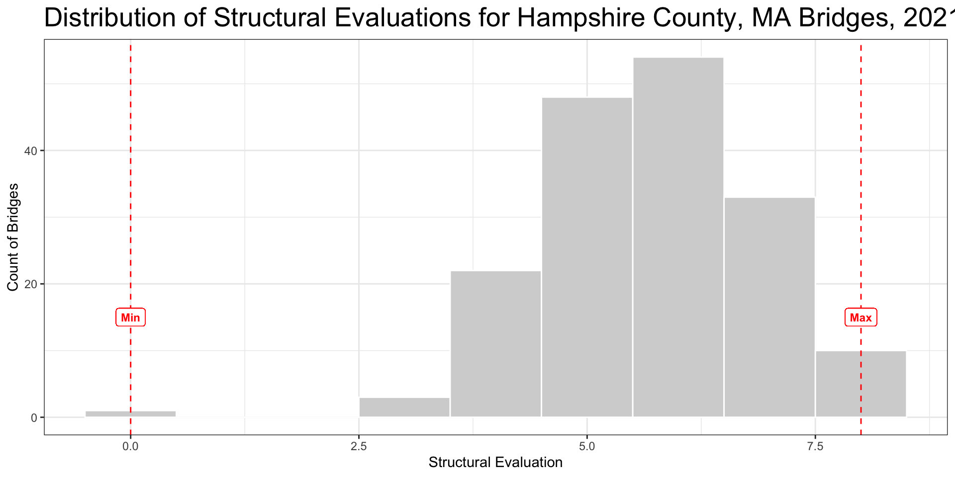
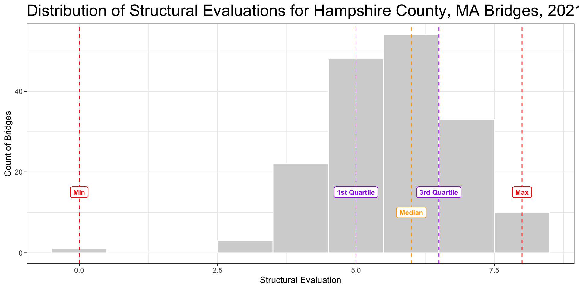
nbi_hampshire <- nbi_ma |> filter(COUNTY_CODE_003_L == "Hampshire")
rm(counties, kinds, maintenance, route_prefixes)Boxplots
SDS 192: Introduction to Data Science
Lindsay Poirier
Statistical & Data Sciences, Smith College
Fall 2022

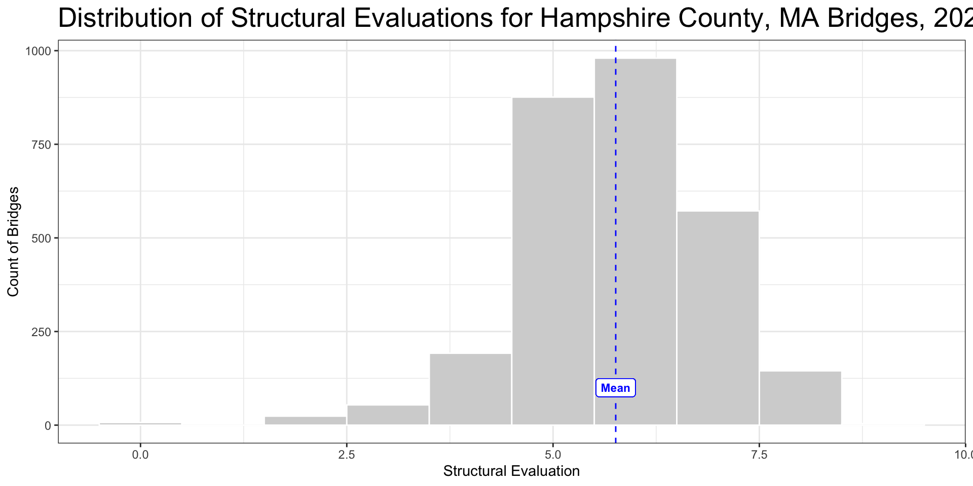
Mean
- Sum of values divided by number of values summed
- Takes every value into consideration
- Model of entire dataset
- Heavily influenced by outliers
Median
- Middle value(s) of the dataset when all values are lined from smallest to largest
- Does not model entire dataset
- Limited influence from outliers
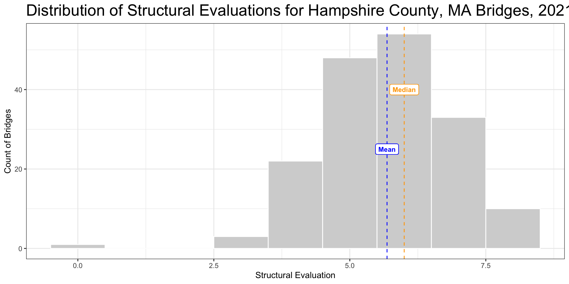
Normal Distributions
- More values huddle around some center line and taper off as we move away from center
- Histogram is symmetrical with a perfectly normal distribution
- Median and mean should be about the same; mean is a good measure of central tendency

Skew
- Histogram is non-symmetrical when there is skew
- Long trail to the right of center indicates a right skew
- Median becomes more representative measure of central tendency than mean

Range
- Maximum value minus the minimum value
- Evaluates the spread of the entire dataset
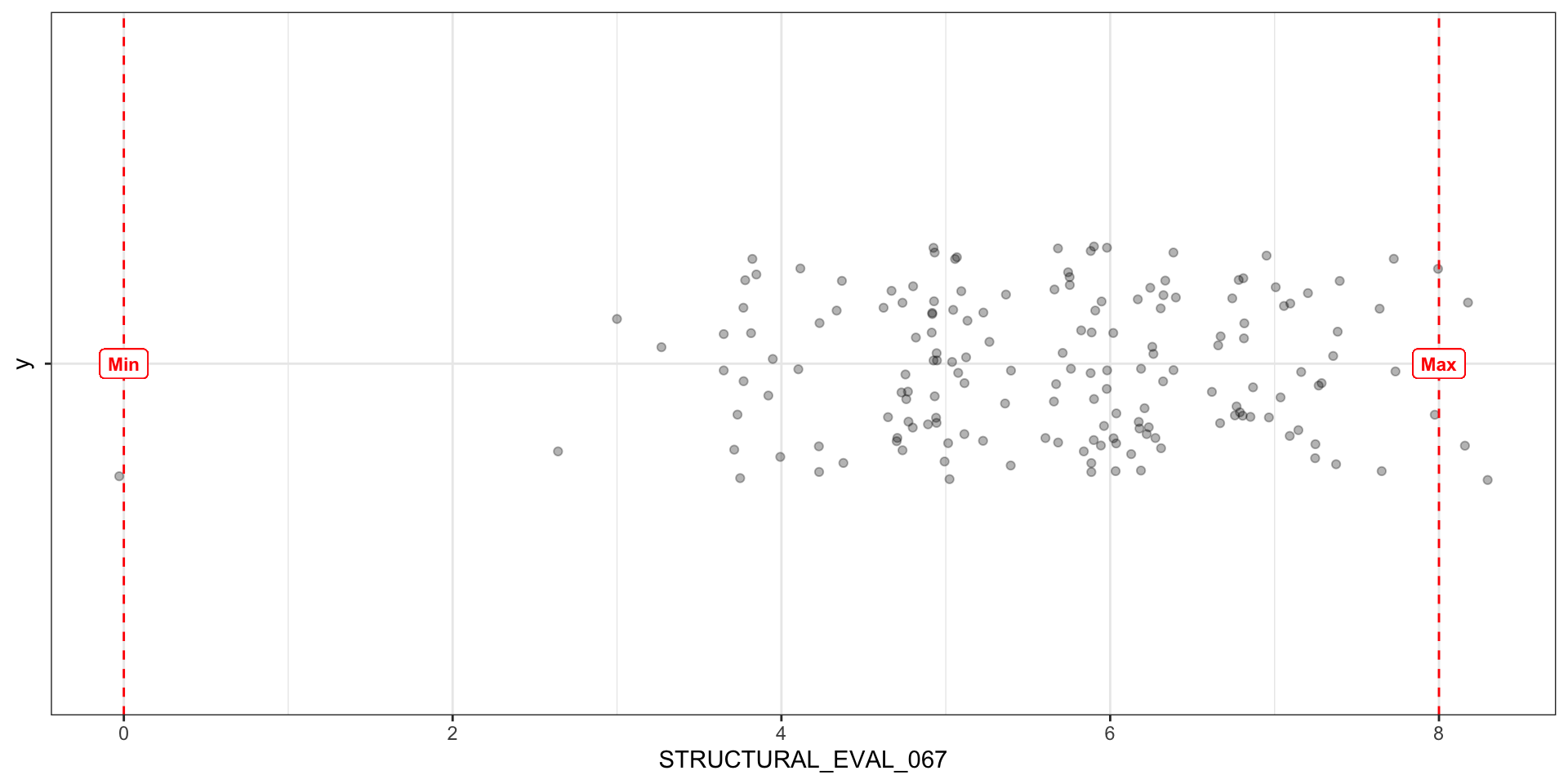
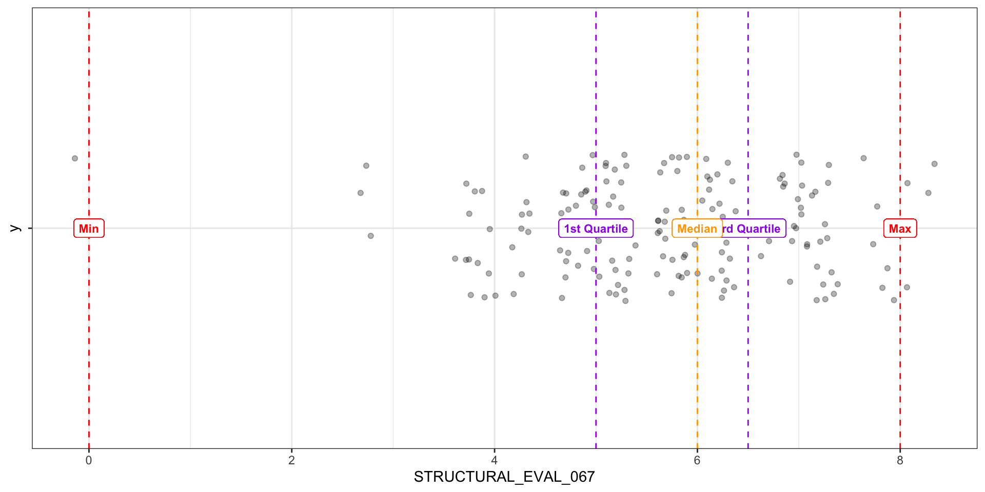
Interquartile Range
- 1st quartile is middle value between minimum and median
- 3rd quartile is middle value between median and maximum
- IQR is the difference between the 1st and 3rd quartile
- Represents the middle 50% of values
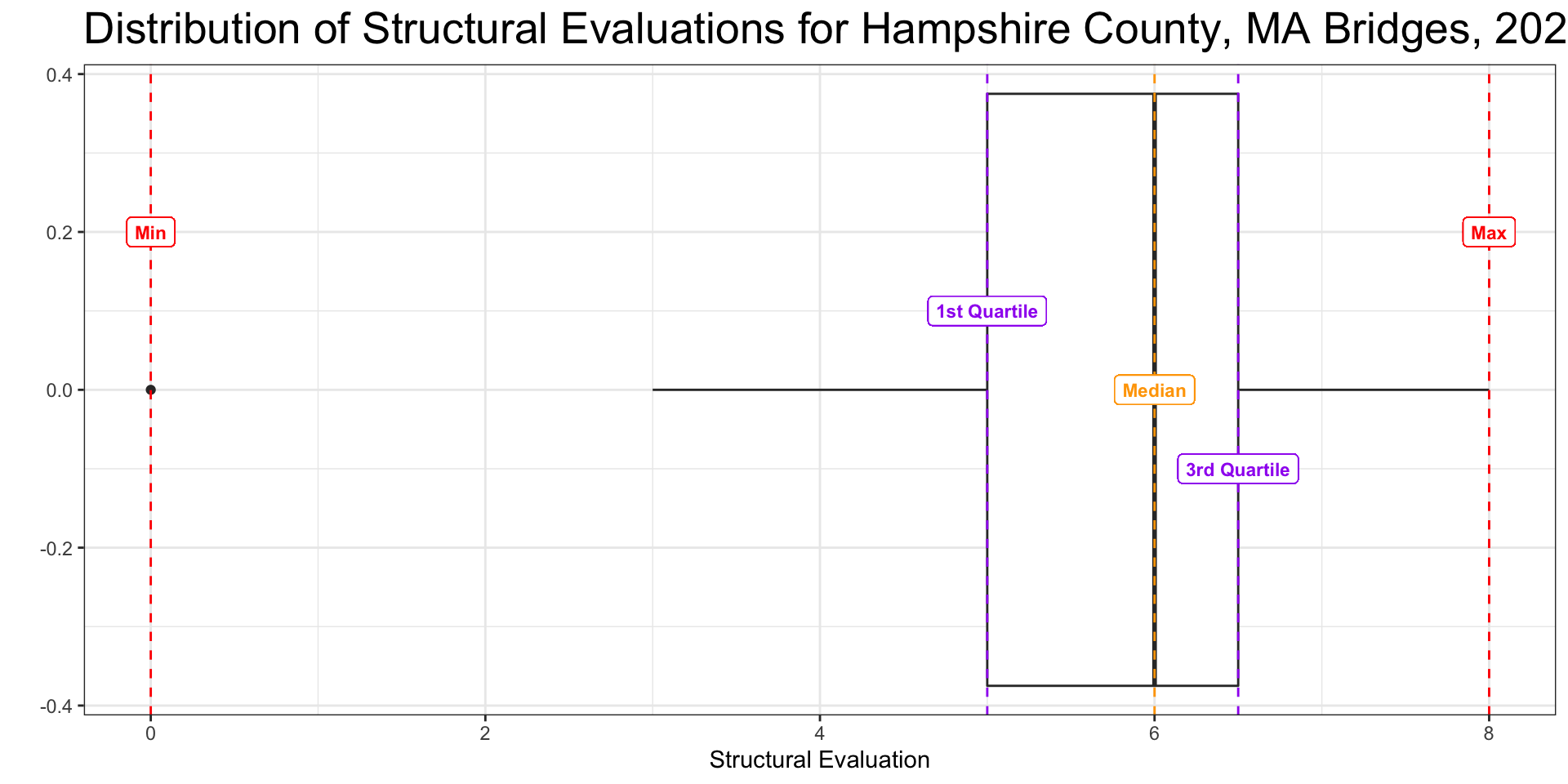
Boxplot
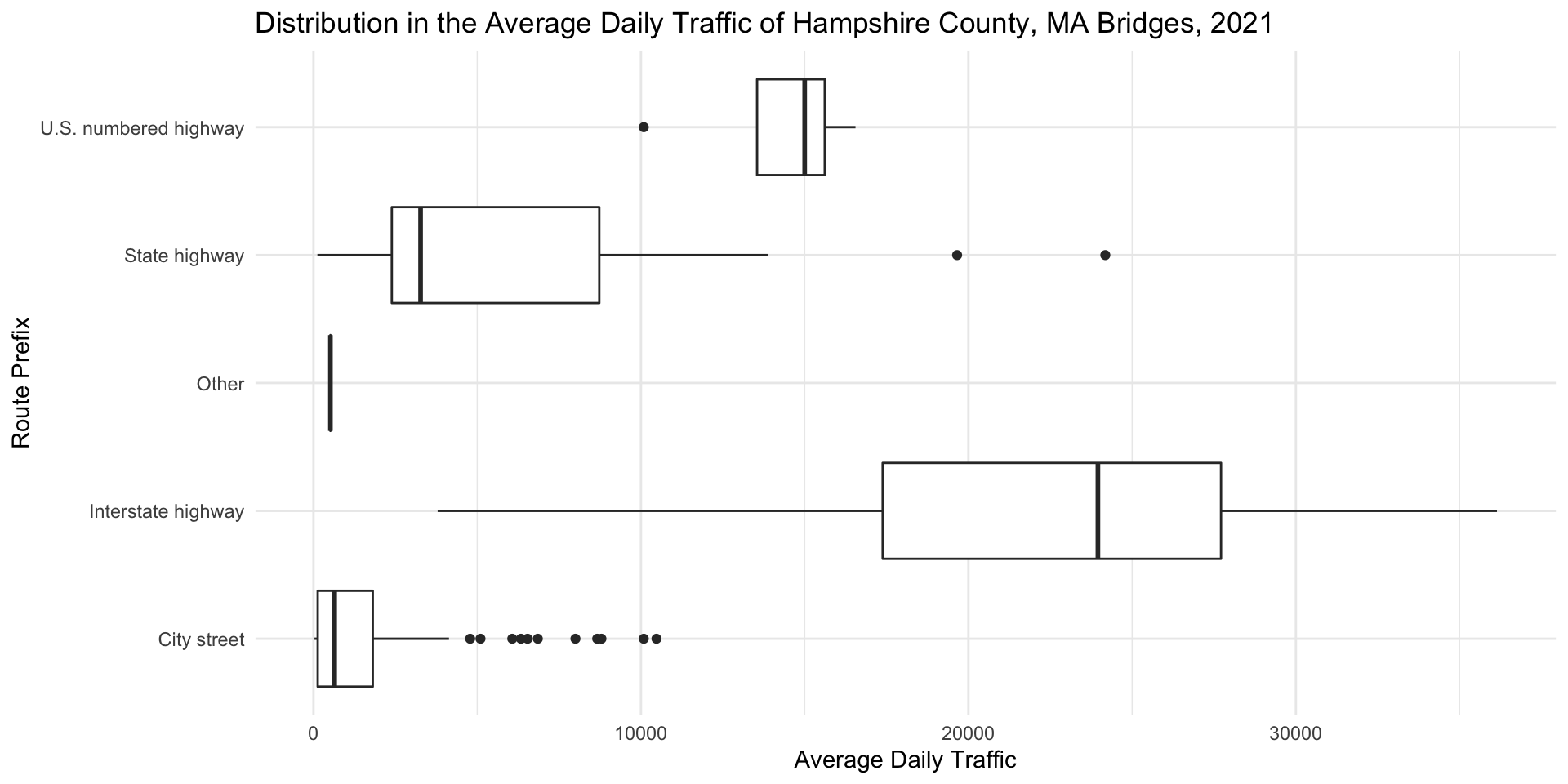
Grouped Boxplots

Interpreting Boxplots Step 1: Check for Outliers
How many are there? What do they indicate? Do you assume they are errors in teh data? Or do they represent extremes that are important for us to take into consideration?

Interpreting Boxplots Step 2: Compare Medians
Do the medians line up? If not, in which groups are the medians higher and in which are they lower?

Interpreting Boxplots Step 3: Compare Range
Do certain groups have a wider range of values represented than others? In other words, are the values more distributed for certain groups than for others? This might indicate a greater degree of disparity in some groups than others.

Interpreting Boxplots Step 4: Compare IQR
In which groups do the middle 50% of values tend to huddle around a central value? In which are they more spread out from the center?

Interpreting Boxplots Step 5: Compare Symmetry
Does the median appear to be in the center of the range and IQR? Is the median closer to the minimum – or the bottom whisker? Or the top whisker?